An omnichannel finance platform for small-town India
Mahindra Finance wanted its loans, mutual funds and fixed deposits on one digital platform. A single experience across web and app for customers coming online for the first time.
Company
Moonraft Innovation Labs, a UST company
Lead Designer
Jul – Dec 2021
Role
Timeline
Team
3 UX · 2 UI, led by me
Web & Android, four product lines
Scope


Mahindra Finance is one of India’s largest lending and investment companies. They wanted four separate businesses on a single platform — personal loans, consumer durable loans, mutual funds and fixed deposits — across a website and a mobile app, so a customer who came in for a phone loan could be sold a fixed deposit two years later.
Moonraft was brought in as customer experience partner. I led the engagement end to end: discovery, stakeholder interviews, CX strategy, UX, UI, the design system, and every client presentation.
Discovery
I ran stakeholder workshops across all three business verticals and collated the output into one matrix which included standout features, target audience, core problems, business goals, success measures.
Putting four product lines on one board meant they could be compared rather than argued about in isolation. It also exposed something none of the teams had seen on their own. Set the business goals beside the audience description, and they did not reconcile.

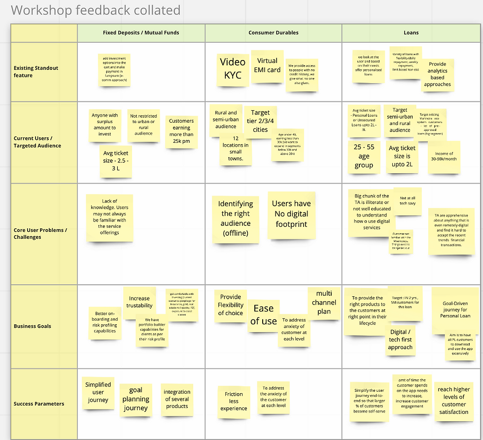
The business was asking for self-service at scale from people who could not comfortably read a form and did not trust digital money. Framed that way, the target stopped looking like a growth problem and started looking like a trust problem.
One goal did appear on both sides of the table, written by the stakeholders themselves and repeated in every vertical:
“address the anxiety of the customer at each level.”
That became the brief I actually designed to.
Persona
Designing for Rakesh, not for a segment
Mahindra’s segmentation came from dealer-level field data rather than a persona workshop. The core customer was 24 and above, earning ₹15,000–25,000 a month, living in small towns and rural areas, able to service an EMI of ₹2,000–4,000.
Three segments sat underneath it.
Cautious Middle Income leaned on the dealer to decide, and was drawn to zero-cost EMI and brand credibility.
Young Aspirational Buyer wanted approval in a minute and had no patience for process.
Rural Customer cared about affordability and transparency above everything, and was reached through last-mile partners like post offices and common service centres.


Mahindra’s consulting partner had also run market interviews with rural and semi-urban customers, and walked our team through the findings in July. Four points shaped the product more than anything else we saw: customers were ready for digital but trust was missing; digital and financial literacy were crucial; they already trusted the Mahindra name; and they wanted a friend or a partner for their financial needs, not a portal.
That last point mattered most. It meant the product could not simply be efficient — it had to behave like someone helping you, which was a very different brief.

Market interview findings, July 2021. Presented by Mahindra Finance team
The evidence
We scored what already existed
Before proposing anything, I put the team through a Nielsen-heuristic audit of Mahindra’s live web properties, its consumer loans app and its field officer app. Each of the ten heuristics was scored out of four, and every finding logged as Issue → Heuristic violated → Recommendation. Scoring it was the deliberate part: a sticky note is an opinion, a number is a baseline the client can be held to.

The radar plots showed the failures clustering on two heuristics: aesthetic and minimalist design, and consistency and standards. Text-heavy pages nobody would read, no hierarchy between primary and secondary buttons, red error text on a red background, and steps that existed for the system rather than the user.

The field officer app was the argument-ending piece of evidence — the tool Mahindra’s own staff used to originate a loan on a customer’s behalf, and proof of what happened when a form was built for the back office rather than the borrower.

Architecture
Drawing the whole journey before designing a screen
I built the information architecture for the platform: ten top-level entries, with language selection placed above the landing page rather than inside settings, and a documented section inventory for every product page so five designers were not inventing structure independently.
Then came the hero task flows, drawn end to end. They separated pre-login from post-login decision points, marked page states and offer pages, and traced every re-entry path back to the landing page or the dashboard — including what happened when someone abandoned halfway through and came back a week later.

The design
Every decision traces back to our target audience
Seven decisions, and the trait of the audience each one answered. None of them were style calls. Each came out of the research, the audit, or something a stakeholder had said out loud.


The prototype
The risk assessment (e2e)
Eleven steps, one question at a time, audio on every question, and help offered at the moment of hesitation rather than filed away in a help centre. The flow ended with a risk profile the customer never had to name or understand, it was assembled from plain answers about their life.

The design system
I owned the design language and had the UI designers build it as a system rather than a set of screens. Components were documented across app, web and card libraries — four header states, partner fund cards carrying real data, distinct variants for new fund offers and sovereign gold bonds, tooltips, footers, cart and watchlist affordances.
The concept phase deliberately used a neutral placeholder brand, so stakeholders reviewed structure before they reacted to colour. The Mahindra red and yellow went on only once the flows were agreed.

Alongside it, an illustration system with its own style guide — stated goal, defined style, locked palette rather than a folder of drawings.

Illustration system. Moustached men in red shirts. An older man reading in a chair. Hands scanning a fingerprint. This was small-town India, not the weightless gradient people every fintech was shipping in 2021 and when the stated barrier is apprehension, seeing someone who looked like you was a trust mechanism, not decoration.
My role
What I owned
Discovery, stakeholder interviews, the heuristic audit, CX strategy, information architecture, hero task flows, UX, UI, the design system, product strategy and every client presentation.
I split the team by product line so three UX designers could work four journeys in parallel, and held the tenets and the component library centrally so the work converged. Alongside that I ran the reviews with Mahindra’s business heads, resolved conflicting feedback from three verticals into a single direction, and defended the decisions, progressive disclosure most of all, that looked expensive on a slide and were right in someone’s hand.
-
IA and pre / post-login site maps
-
End-to-end task flows with video KYC branching
-
Scored heuristic evaluation of the existing estate
-
Wireframes across four product lines
-
Desktop and responsive web, plus Android
-
Full visual language and illustration system
-
Component libraries for app and web
-
Prototypes: landing, goal planning, risk assessment, loan against FD
Outcome
It never shipped
Personal Loan and Consumer Durables were cut halfway. Fixed Deposits and Mutual Funds were finished and handed over. Then Mahindra reorganised, and the project went with it.
The screens are not what I kept. I learned to make a case with evidence instead of taste, which is the only thing that works with business heads. I learned that five designers stay aligned because of shared principles, not because you review their work more often. And after six months designing for someone who had never been online, I ask a lot less of people on a screen than I used to.
Designing for low literacy, low bandwidth and low trust made me a better designer for everyone.
© 2026 by Rajashri Achar. Created on Wix Studio.